Intro to Framer Motion, an Animation Library for React
Table of contents
Introduction & Prerequisites
Installation
Framer Motion Basics
Introduction & Prerequisites
Framer Motion is a production-ready animation library designed for React. Framer Motion simplifies the process of adding animations by using unique components and props which act as an interface for adding animated properties to elements.
This page will serve as a quick, easy, and informative guide to getting started with the Framer Motion animation library. It will cover the first time installation and set-up of Framer Motion, foundational knowledge of animation components & props, an overview of a few key modifiable values, and a couple of quick tricks. A list of resources will also be included at the end.
Before starting with the Framer Motion library, you should have some familliarity with React (specifically the use of props & components) as well as basic knowledge of CSS.
Installation
Before using Framer Motion, you first need to have a React project set-up for you to add animations to. If you haven’t made a React project before, you can follow the steps outlined in the React documentation. Now that you’ve made your React project, we can now add Framer Motion. To do so, we first need to install the Framer Motion package:
npm install framer-motion
Then on any page where you want to use Framer Motion, add the following import statement to the top of the file:
import { motion } from "framer-motion"
And with that, you are ready to start using Framer Motion!
Framer Motion Basics
Motion
The motion components are the core elements of Framer Motion and serve as the foundation for animating HTML elements in your React components. The most basic of these is motion.div:
<motion.div />
By itself, a motion component won’t do anything special. The real magic happens when you wrap other components within it. By passing animation props to your motion component, you can easily animate anything contained within. The most foundational of these props are initial and animate.
Animation Props
inital represents, as the name would suggest, the initial state of animation. You can think of this as the “starting position” for your element. If not specified, the initial state will just be the base properties of the element. animate, on the other hand, represents the final state of your animation. Framer Motion will automatically fill in the transitional states between when animating unless otherwise specified (which we will touch upon later). You fill in each respective state with the style arguments you wish to have. Take the following code:
    <motion.div
      className="box"
      initial=
      animate=
    />
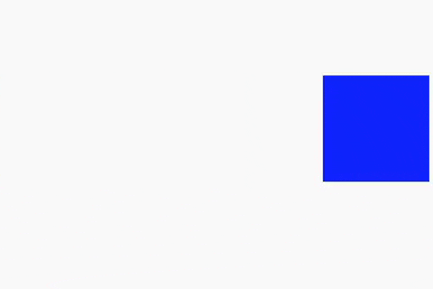
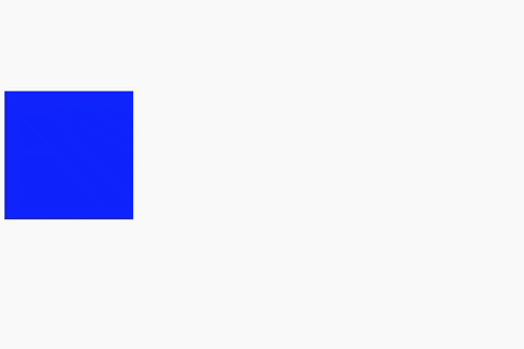
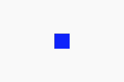
We will assume that there is some associated CSS code such that defining className="box" will present a box on screen. Initially, the box will start at an x position of -300px, but will automatically be animated to progress towards an end x position of 300px as defined in animate. See a possible result below:
There are many other properties you can animate, such as opacity and scale.
Transitions
You may notice that the animation above seems a little bland. To fix this, we can add a transition prop, which defines how Framer Motion should progress between states. Framer Motion has a few pre-defined transitions which you are able to easily implement in your animations. For example, easeIn will cause the animation to start more gradually. You can also specify a duration for how long you want the animation to take. You may find more about transitions and any pre-defined values here. See a possible implementation below:
    <motion.div
      className="box"
      initial=
      animate=
      transition=
    />
Keyframes
Keyframes provide a way to define specific states of an animation at different points in time. By specifying keyframes, you are able to exert more control over the fine details of an animation sequence or create more complex animations. To specify keyframes, simply pass in an array of your desired values as an argument to your animation prop. Note that every value in a keyframe array must be of the same type (i.e., number, px, vw, etc.):
    <motion.div
      className="box"
      animate=
      transition=
    />

Variants
Variants essentially allow you to externally define some set of animation properties as a variable or constant that you can then apply to multiple components as desired. This can help prevent a lot of repetitive code and allows you to easily reuse animations. You can loosely think of variants as a dictionary where each key represents an associated set of animation values:
  const example_variants = {
    big: { scale: 2 },
    small: { scale: 0.5 },
  };
  return (
    <motion.div
      className="box"
      initial="small"
      animate="big"
      variants={example_variants}
      transition=
    />
  );
Conclusion
With this, you should have a good grasp on the basics of Framer Motion! Much like CSS, there are a ton of options as far as customizability goes, so it is highly recommended to read the documentation and to experiment in order to see the full scope of the Framer Motion library. Happy Animating!